Art Style Type
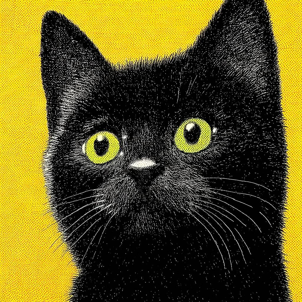
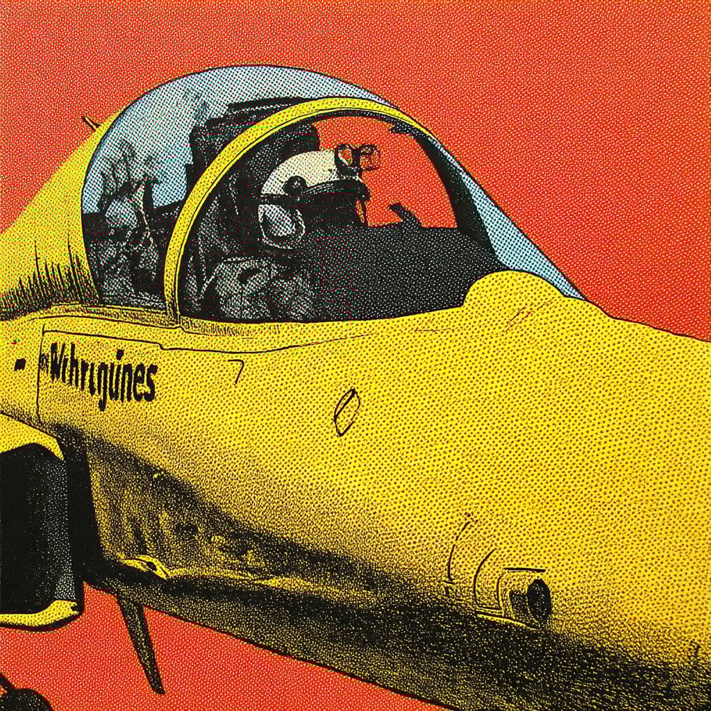
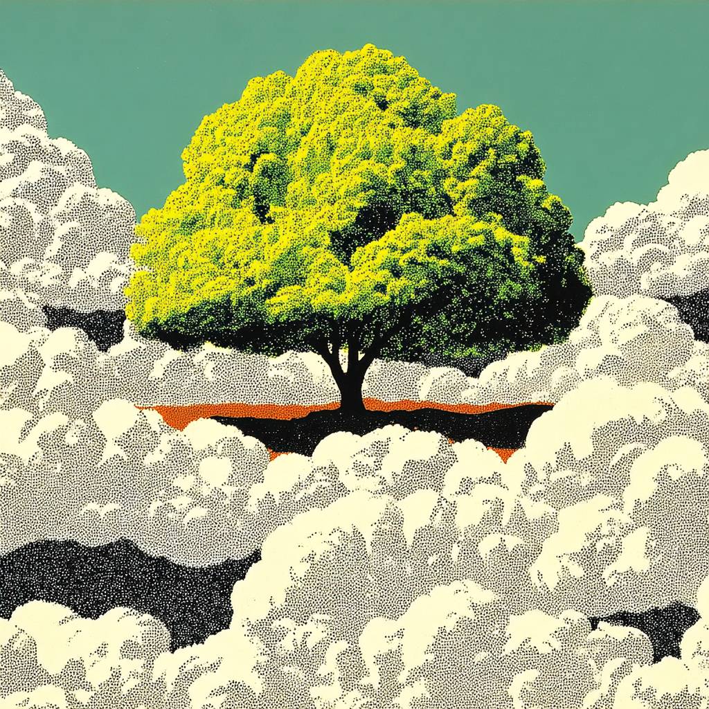
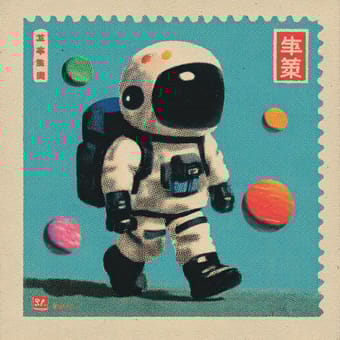
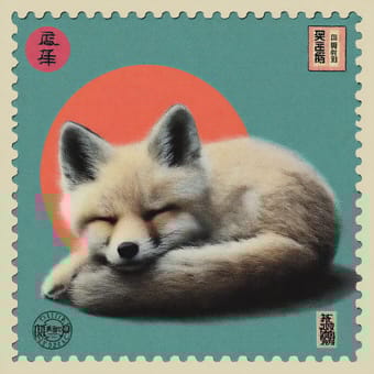
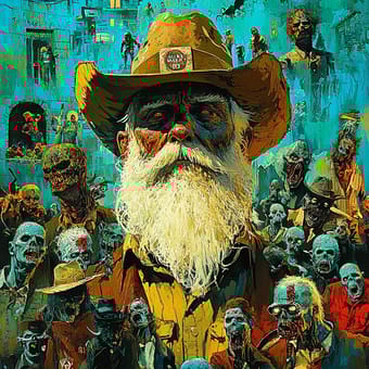
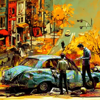
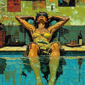
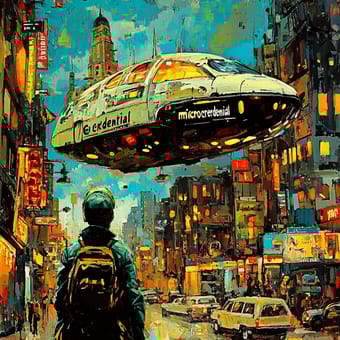
This SREF style blends pop art, vintage print art, and halftone engraving techniques. It displays a clear mid-20th century commercial illustration style, but gains a contemporary feel through vibrant color contrasts and rough texture treatments. The style evokes Andy Warhol's screen printing works, but with added texture details and color separation effects.
Style Characteristics
The most distinctive features of this style are bold color contrasts and pronounced grainy textures. Each image uses a limited but vivid color palette, typically combining bright colors like yellow, red, and green with black. The images exhibit clear halftone dot patterns, similar to what you'd see when magnifying old printed materials. Line details are simplified and enhanced, creating a visual effect that sits between photography and hand-drawn illustration. The overall impression is both retro and modern, creating a compelling artistic tension.
Style-Enhancing Prompt Keywords
- Halftone printing: Enhances the grainy texture and dot-pattern effects, strengthening the vintage print visual characteristics
- High contrast: Elevates the distinct boundaries between colors, making the image more bold and eye-catching
- Screenprint style: Adds layering and color separation effects, creating an artistic feel similar to handmade prints
Recommended Application Scenarios
This style is particularly suitable for music album cover designs, retro-themed posters, cultural event promotions, independent magazine illustrations, trendy clothing pattern designs, and any visual project requiring a nostalgic yet not outdated look with strong artistic appeal and pop culture accessibility.